
Transform digital media overload into investigative insight
Swiftly process and analyze vast amounts of images and videos. Stay ahead in investigations with powerful analytics and collaborative capabilities, gaining a crucial edge in digital media analysis.
Customer story | a New York law enforcement agency
Learn how a New York law enforcement agency used Magnet Griffeye to accelerate child exploitation investigations and help preserve officer wellness.
Griffeye features
Elevate your digital media investigations with advanced image and video processing and analysis, collaborative case handling, and shared workload capabilities.
Griffeye features
Elevate your digital media investigations with advanced image and video processing and analysis, collaborative case handling, and shared workload capabilities.
Griffeye features
Elevate your digital media investigations with advanced image and video processing and analysis, collaborative case handling, and shared workload capabilities.
Griffeye features
Elevate your digital media investigations with advanced image and video processing and analysis, collaborative case handling, and shared workload capabilities.
-
Griffeye features
Automate, detect, prioritize
-
Griffeye features
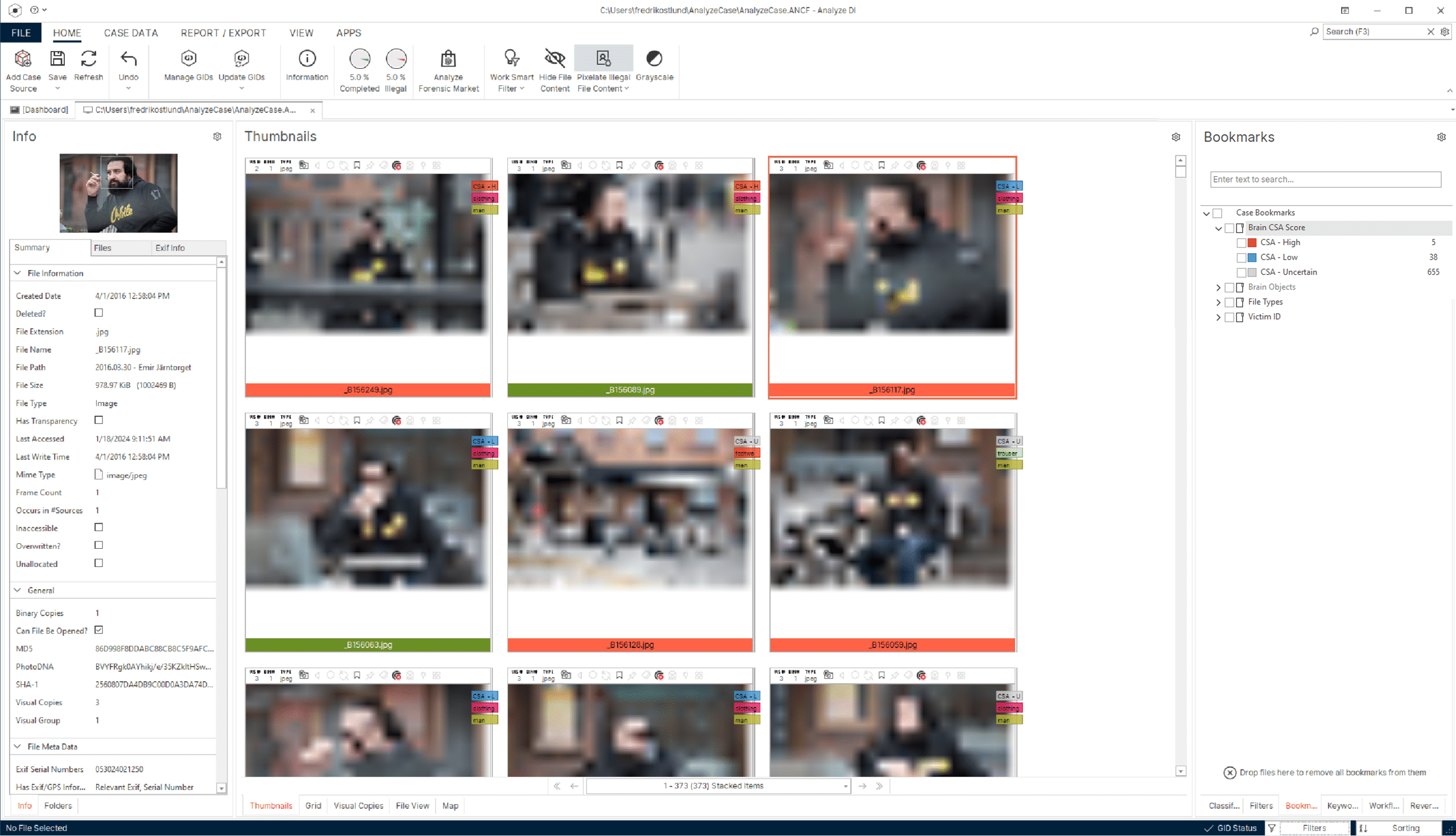
Advanced media analysis
-
Griffeye features
Large-scale collaboration
-
Griffeye features
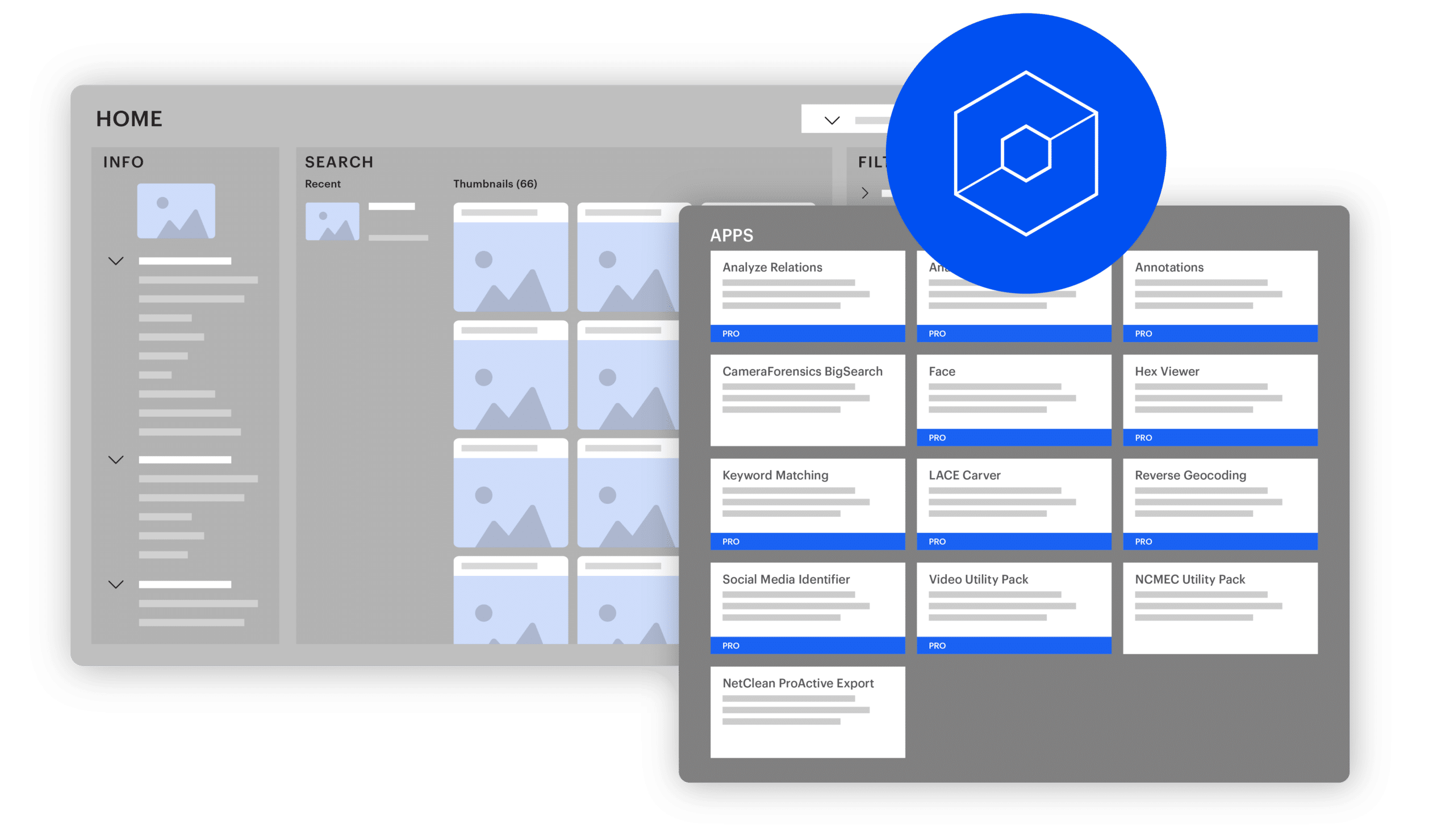
Open, modular, scalable
Automate, detect, prioritize
Magnet Griffeye handles the heavy data lifting, freeing investigators to focus on the human-centric tasks that demand their attention.
Key takeaways:
- Gain a clear indication of where to begin your investigation and identify the most relevant data for the case.
- Utilize AI technologies like Brain and Thorn.AI to automatically detect and classify various objects in large image sets, as well as identify and flag previously unseen images and videos depicting child sexual abuse.
- Save valuable time and energy through the pre-categorization of known data, stacking duplicates, and correlating metadata and visual attributes in your media files.
Advanced media analysis
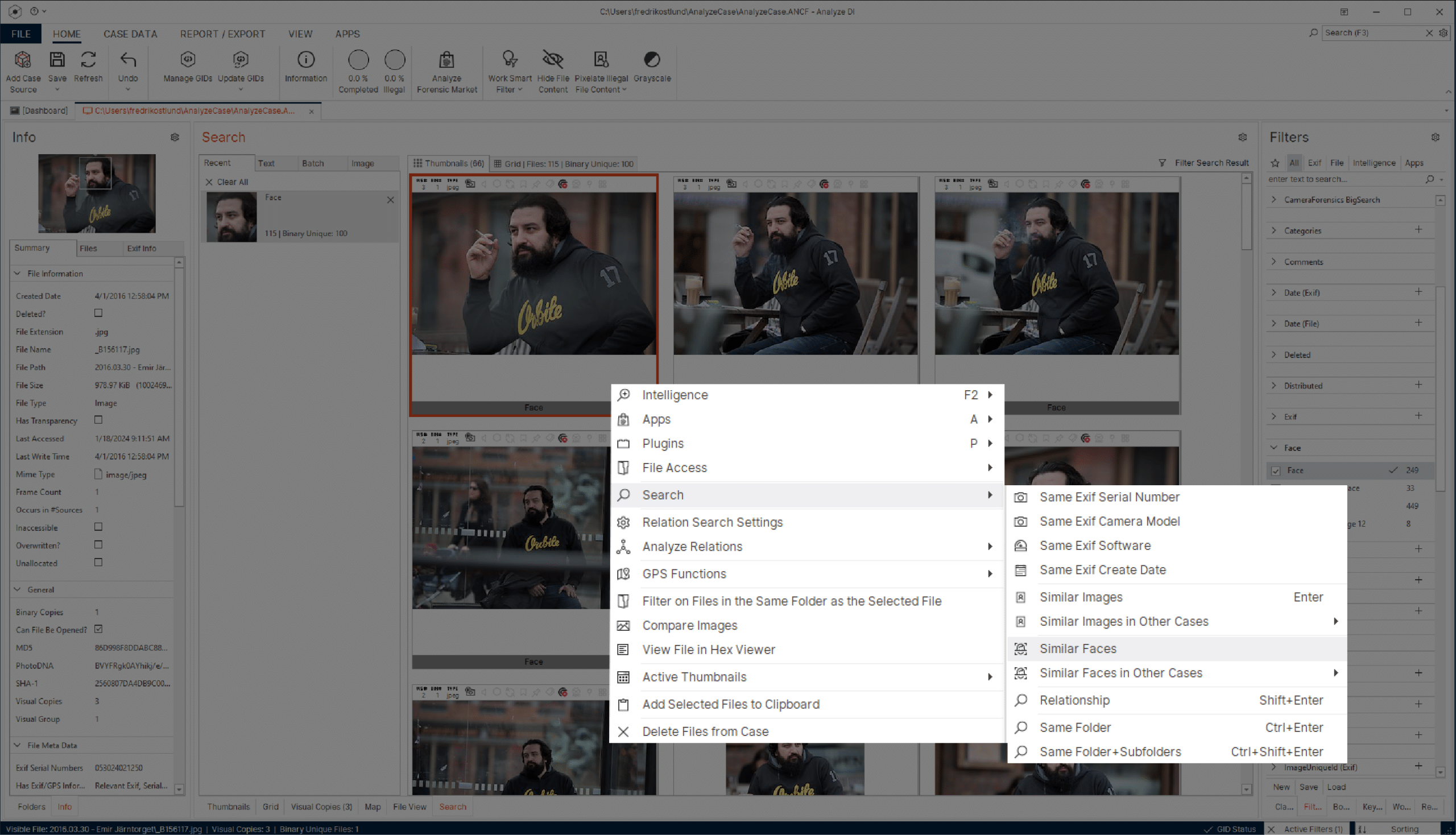
Access a powerful set of analytical features, capabilities, and flexible workflows for a seamless and efficient experience.
Key takeaways:
- Quickly find and match all images and videos featuring different individuals, and search between the data to identify matching faces of suspects or victims.
- Rapidly and accurately review hours of video footage in a fraction of the time using advanced filtering capabilities such as motion, facial, and object-based searches.
- Enhance investigator well-being with multiple features designed to minimize exposure to harmful material.
Large-scale collaboration
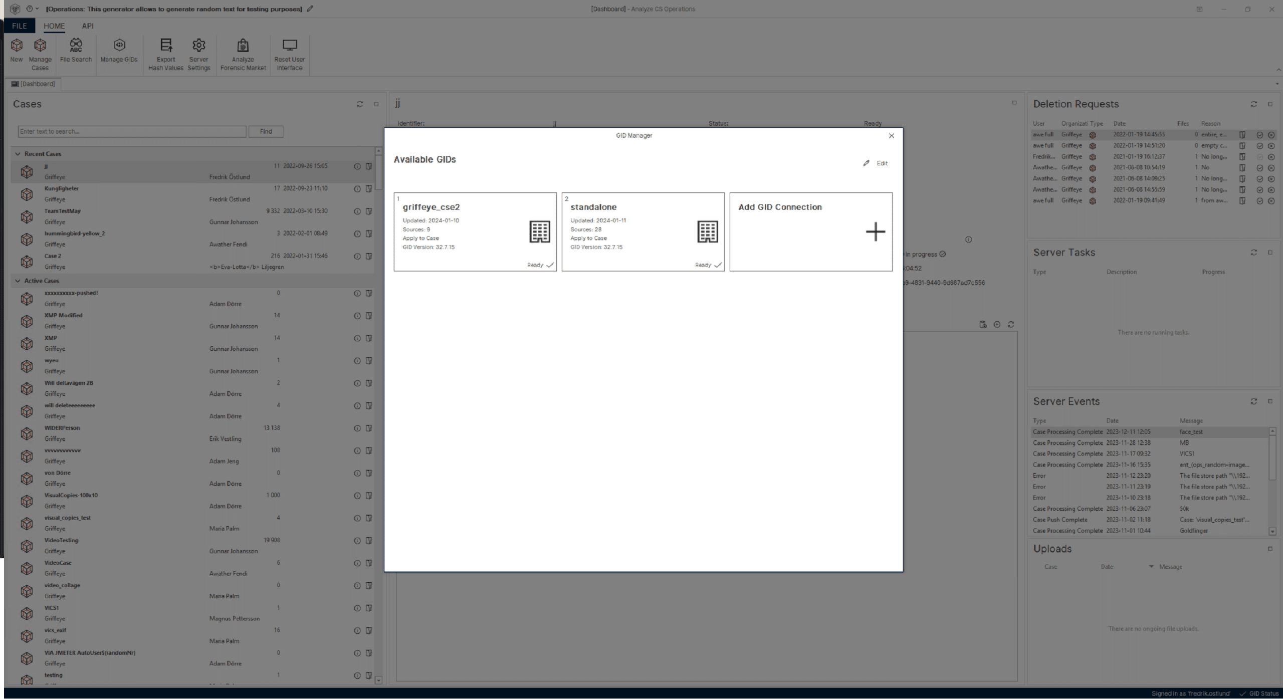
Magnet Griffeye incorporates cutting-edge technology designed to interconnect investigators and make information sharing a seamless process.
Key takeaways:
- Establish connections to multiple GID databases, including external sources such as NCMEC, to seamlessly collaborate with investigators on a national or international scale.
- Hashes and added intelligence are easily uploaded to any shared GID for direct accessibility by other investigators on both ongoing and previous cases.
- Effortlessly identify previously viewed media and reduce the number of case files that need to be reviewed.
Open and modular
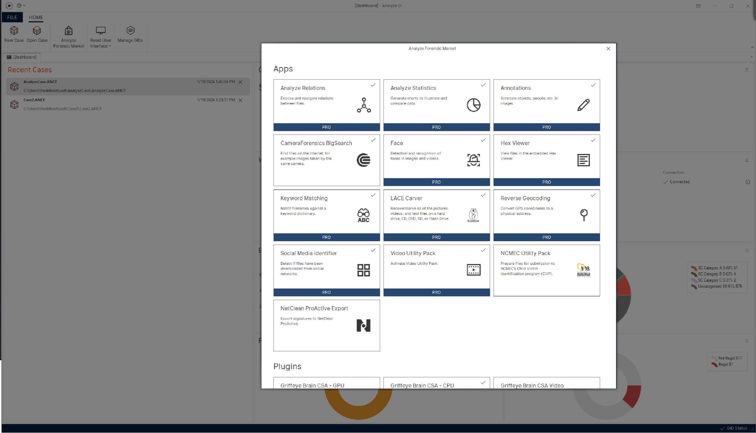
Unlock the potential of an open and modular platform designed for flexibility. Customize Magnet Griffeye to fit your needs—effortlessly integrate external sources and tools, allowing you to add new functionality as your needs change.
Key takeaways:
- Explore a dynamic marketplace for apps and add-ons, including third-party options.
- Effortlessly customize and enhance functionality to always have the best tools for the job.
- New innovative tools are continuously added and updated.
Find the right solution for your needs
What’s included:
- Image and video categorization, and stacking of duplicates.
- Grouping and searching of media files.
- Intuitive reporting for exporting and sharing results.
- Single installation (for individual use).
Lite is our limited, free version offered to law enforcement officials to navigate digital media more efficiently.
What’s included:
In addition to the standard capabilities in Griffeye Lite, you’ll also benefit from...
- Automated processes and functionality to detect critical content in unseen material, reducing manual work and exposure.
- Advanced analysis such as Facial Recognition, a robust Video Utility Pack, and additional matching and searching functions.
- Collaborative efforts and intelligence sharing through Griffeye Intelligence Database (GID).
- A library of apps and plugins, including AI tools and other third-party options, for customizable extension.
- Seamless workflows for investigative work, including easy import/export across units.
- Dedicated support team to assist you with any inquiries.
Griffeye Processing Engine: streamlined workflow from extraction to case analysis.
Products for public sector agencies

Scale up your capacity in digital media investigations by leveraging the collective knowledge, skills, and efforts of your entire team.

Centralize all media material ever collected by your organization, helping you build on each other’s case work and optimize results.

Scale up resources and increase lab efficiency & capacity by automating evidence processing and data exports.
Speak to an expert today
Get started with Magnet Griffeye
Stay ahead in investigations with powerful analytics and collaborative capabilities. Speak with an expert today!